The new collection is inspired by different moments and films in Mothra’s history. How did you choose which eras and images to design around?
I really just based this collection on striking imagery. I was looking through pages and pages of assets and found myself gravitating toward certain screenshots from these films. I figured that if these images were speaking to me, they would speak to the rest of the fanbase.
There is a wonderful use of vintage fonts in the collection, such as the English Mothra logo from the original film. Can you share any thoughts specifically about Mothra fonts?
I love that English Mothra logo so much! I thought it looked really unique when outlined. We printed that outline with puff print ink, so it is ever so slightly raised and has a cool handfeel.
You really can’t go wrong pairing some of these retro typefaces with Godzilla and Mothra imagery. They work so well together and feel very timeless.
What is your design philosophy when creating goods for Godzilla Store US? For example, do you want the graphics to be big, bold, or leave a certain kind of impression?
My philosophy changes from project to project. Each new project has its own context, and it’s important that I do some research to understand that context so I can create something that will resonate properly. Right now, I am certainly into big, bold, and colorful types of design. I want to create something that is true to the brand identity, yet stands apart from the rest of the merch that is out there.
How important was color in shaping the collection, especially with a character like Mothra who has such a distinct look?
Color is everything! I wanted to achieve a balance between this gritty vibe and using as much color as possible. I feel like a good representation of this is the Terror Tee. When you first look at this design, you almost don’t realize that there are five different colors featured. Then, when you look a little closer, you see how these colors are used as a tool to tell a visual story.
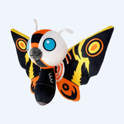
Were there any special challenges or considerations in designing around Mothra compared to other kaiju from the Godzilla series?
I feel like most Mothra merch I see is more on the cutesy side. I wanted to really lean into the idea that Mothra is a force to be reckoned with. Mothra is the Queen of the Monsters, and I wanted to showcase why it is deserving of that nickname with imagery that is more on the gritty side.
Do you have any favorite pieces or items in the new Mothra collection?
My favorite piece is the Prowl Hoodie. A lot of intention went into how this piece was printed. I made sure we utilized puff print screen print ink for the Mothra logo on the back. This gives the print a really cool handfeel that is reminiscent of silk webbing or a cocoon.
I have a very specific vision when it comes to the photorealistic prints featured on the front of the hoodie. I made sure that the black in the image was “dropped out” instead of printed. This means that the black you see is actually the fabric of the garment. You see this in vintage band T-shirts, and I really believe it is the secret ingredient in bringing merch design to the next level.
Do you have any special message for Mothra fans?
I hope you guys enjoy the merch! Mothra 4 life!
Celebrate Mothra Year in 2026 by exploring the new Mothra Collection at Godzilla Store US and taking part in a global anniversary honoring one of kaiju cinema’s most enduring icons.